An Introduction to Spatial Analysis in R
Download a pdf of this course with dataWhy you should learn R
It takes a lot of effort to learn to program and to use R. So why bother? Here are some very good reasons
1. R is free
2. R programs are repeatable. You can share them with others, or look up your old programs when a reviewer asks you months later to repeat that figure, but just include the outliers this time.
3. R is relatively fast at performing analyses (compared to many GIS programs)
4. You can combine state of the art statistics with great visualisations, including maps. Many leader's in their fields develop packages for R, so if you can use R, you can get access to these pacakges.
5. You can iterate repetitive tasks. This saves you time and means you can do things like model the distributions of 100s of species instead of just one, or make predictions at a global scale, instead of only local scales.
6. I think it's a lot of fun.
Who I am
I come from a background of field ecology and ecological modelling. I realised that being able to perform your own quantitative analyses is incredibly useful (and helps with getting jobs). Hence, over the past few years I have been teaching myself how to use R. I use spatial analyses in R for a wide-variety of purposes, including producing publication quality maps and for analysing the extent of climate change impacts on ocean ecosystems.
I designed this course not to comprehensively cover all the spatial tools in R (there are far too many to cover in one course), but rather to teach you skills for getting started. You can build on the basics we teach you today to perform a wide variety of spatial analyses. Every new project comes with its own problems and questions and I have found having some knowledge of spatial tools in R allows me to develop new tools and analyses as they are needed.
Workshop aims
- Get an overview of spatial data manipulation in R
- Learn how to get help with R
- Learn some basic spatial analysis in R
- How to navigate R objects, particularly spatial objects
- Learn how to combine different types of spatial object
- Learn about map projections and how to change them
- Make a nice map
- Plan a complex workflow
- Spatial modelling (Advanced users)
The course has been designed to be accessible for people with a range of R abilities. At the very least you should have some limited experience in R, like reading in datasets and calculating summary statistics. I hope regular R users will also find something useful here. I have also included tasks for “Advanced users”. If you are going well with the basic tasks, feel free to tackle these. If you are struggling with the basic tasks, then I recommend skipping the tasks labelled “Advanced users” today, you can always come back to them later.
Writing the code
I provide most of the code for completing the tasks in the workshop below. However, this code may not work if you paste directly from the manual (because docs can contain hidden formatting). I encourage you to type the code out from the notes. This will also help you learn and understand the tasks. Even better, try changing the code to change analyses or figures.
Acknowledgements
Thanks to Ross Dwyer for inspiring the original idea for the course. Also thanks to Ben Gilby and Chris Roelfsema for helping me out with some data-sets.
Use and feedback
The course is designed to be freely shared with anyone. Please point people to my webpage if they want to download a copy. I can be reached on email at chris.brown@griffith.edu.au if you have comments. Feedback is appreciated. I would not recommend using any of these data-sets for real analyses, as they have been modified from the originals. If you want to get your hands on the original datasets, please see the references below.
The course and the data-sets
Today you will be provided with a series of datasets from Moreton Bay. Our ultimate aim is to identify the drivers of distribution for some new marine species. To get there, we have to manipulate spatial data-sets for marine habitats and environmental variables so we can match them to our species data.
Last weekend I randomly deployed 70 underwater video cameras across the Bay, to see what fish swam past. Strangely, for such a well studied bay, I was able to identify two new species, which have since been named Siganid gilbii, a herbivorous fish and Sphyrna stevensii a top-level predator. For each camera site, I was able to identify the presence or absence of these two species.
I want to test some hypotheses about the drivers of these species' distributions. Then I want to predict their probability of occurence across the bay, for future monitoring and conservation. S. gilbii is an herbivore, so I think it should be related to the presence of seagrass beds. I am also concerned about the impacts of fishing and water quality on this species. For fishing we can look at video sites that are inside or outside marine reserves. As a proxy for water quality, we can use distance from the two major rivers (Brisbane and Logan) that run into the bay.
The data-sets are all in different projections and have different extents. An annoyingly common problem (especially when they come from different people) that we will learn how to deal with today.
The seagrass data is derived from Roelfsema et al. (2009)1, and I have made the distance to rivers data-sets. Today we will focus on the S. gilbii data, but feel free to try and analyse the S. stevensii data if things are going well for you. S. stevensii is a predator, so we think it may follow its prey S. gilbii but it may also be affected by water quality and fishing.
1. Roelfsema, C.M., S.R. Phinn, N. Udy and P. Maxwell (2009). An Integrated Field and Remote Sensing Approach for Mapping Seagrass Cover, Moreton Bay, Australia. Journal of Spatial Science. 56, 1 June 2009
Alright, let's get started with R.
Getting started
Obtaining R
R can be downloaded from http://cran.r-project.org/
Using a script editor, such as “RStudio”, can also be helpful. RStudio can be downloaded from http://www.rstudio.com/. If I am starting to confuse you with terms like ‘script' please send the glossary in the appendix.
Starting RStudio
Click the RStudio icon to open R Studio. The interface is divided into several panels (clockwise from top left):
1. The source code (supporting tabs)
2. The currently active objects/history
3. A file browser/plot window/package install window/R help window (tabbed)
4. The R console
The source code editor (top left) is where you type, edit and save your R code. The editor supports text highlighting, autocompletes common functions and parentheses, and allows the user to select R code and run it in the R console (bottom right) with a keyboard shortcut (Ctrl R on windows, command-enter on macs) From now on, I will be providing you with code that you can type in yourself. Code will appear in this font: plot(x,y)
Installing packages
R offers a variety of functions for importing, editing, manipulating, analysing and exporting spatial data. Most of these functions rely on add-on packages that can be loaded to an R session using the library(packagename) command. If you close R and restart you will have to load the packages again.
If your required package is not already installed on your computer, it can be simply installed by implementing the following command (you must be connected to the internet):
install.packages("sp")Multiple packages can be loaded at the same time by listing the required spatial packages in a vector. Here we will install all the packages you will require for today's course:
install.packages(c("sp","rgeos","rgdal","maptools","raster"))Also a couple of optional packages:
install.packages(c("RColorBrewer","wesanderson","dplyr"))Select the local CRAN mirror (e.g. Canberra).
If you are using a mac, rgdal and rgeos cannot be installed in this way. See my webpage for more help (https://sites.google.com/site/seascapemodelling/installing-rgdal-on-osx)
Starting a new script
Let's open a new script and save it to your harddrive.
When writing R scripts, use numerous # comments throughout your R scripts, you will thank yourself when you go back to the analysis later! Similarly at the start of your code, put some meta-information, such as:
# who wrote the code?
# what does the code do?
# when did you write the code? etc.
The more projects you work on and analyses you do, the more important it is to have this meta-information at the beginning of your code.
Spatial packages
We usually start a script by loading the neccessary packages with the library() function:
library(sp)
library(rgdal)
library(rgeos)
library(maptools)
These add-on packages contain everything we need for the first half of today. sp defines spatial objects and has a few functions for spatial data. rgdal is R's interpretation of the Geospatial Data Abstraction Library. It contains definitions and translations for projections for rasters and vectors (data types we will come to later), and is something like the babel fish for projections. rgeos is an open source geometry engine, and is used for manipulation of vector data. For instance, if we want know the land area of an island with lakes on it, rgeos will do the job. maptools has additional useful spatial tools. Take a moment and reflect how awesome it is that large teams of people have made all these packages open-source and that others have written packages to use them in R.
Moving on. You will need to set your working directory to the folder where the datafiles for this course are: setwd('mypath/Datasets') You can get the path by using your folder browser and right clicking and selecting properties, then just copy the path. Note on windows paths will be copied with \ rather than / so make sure you turn them around in your script.
Spatial points
Read in points
Our first data-set is a typical dataframe, a format you should have worked with in your past R experience (if you haven't I recommend doing a begginer course and getting some more experience before you take this course). The only difference with this dataframe is that samples also have coordinates. Let's read it in:
dat <- read.csv('Video monitoring sites.csv', header=T)
class(dat)
head(dat)
str(dat)
These commands tell us ‘dat' is of Class data frame (see glossary in appendix), we can look at the top six rows and see that each row is a single site. str(dat) let's us look at how our objects are structured.
A primer on list objects
We will break to discuss list objects in R
Exploring the dataframe
There are a few ways to extract specific variables or sites from the data frame. The $ is used to indicate specific variables. Try typing dat$s.gilbii. You can also call variables by their column numbers dat[,3] gets the third column. dat[5,] will give you all variables for the 5th site. We might also want to find out the number of sites, and having a nsites variable will be useful later on.
nsites <- nrow(dat)
nsites
We might want to explore some summaries of the data too. For instance make a table of occurences of our two species
table(dat$s.gilbii, dat$s.stevenii)We could do a simple plot of the sites by: plot(dat$x, dat$y). Another useful skill is subsetting dataframes, for instance, so we can just plot sites where S. gilbii occurs. We can do this using the which() function.
isgilbi <- which(dat$s.gilbii==1)
isgilbi
which() finds rows where s.gilbii equals 1 (note the double =, which means ‘does it equal 1', rather than ‘make it equal 1'), which is where the species was recorded on the cameras. We could use our new variable of row numbers to plot the points where S. gilbii is present in red.
plot(dat$x, dat$y)
points(dat$x[isgilbi], dat$y[isgilbi], col ='red')
If you are struggling to make sense of the which() command, don't worry. Indexing is a basic programming skill, but it can take some time to get your head around. If you are looking for a book to help you can't go past The Art of R Programming by Norman Matloff. It's a great read and I read it cover to cover in almost a single sitting. Once you master simple programming tricks like indexing a whole new world of data manipulation and analysis (not just spatial!) will open up to you.
Turning points into a spatial object
So far we have been treating the dataframe as a normal, non-spatial dataframe. We want to convert to a Spatial Points Data Frame (that's a new Class). This will enable R to uniquely recognise the coordinates for what they are and let us match up this dataset with others we will use later.
To create a Spatial Points Data Frame, tell R which columns of dat are coordinates
coordinates(dat) <- ~x +y
class(dat)
str(dat)
dat
coordinates(dat)
dat@data
Note the class and structure has changed now. The coordinates are now stored separately. Site coordinates are matched to the original data, which can now be found in the ‘data' slot. More on slots later.
Plotting with different colours for animals
Creating a Spatial Points Data Frame opens up new possiblities for visualising the data. One useful feature of R is that many functions will have different ‘methods' which mean you can use the same function on different types of data. Try the below plotting functions one at a time and see what happens.
plot(dat)
lines(coordinates(dat))
spplot(dat)
spplot() comes with the sp package and is a useful tool for quickly viewing data.
Finding help
Knowing how to find help for yourself is a critical part of using R. Anytime I code something, I spend a lot of time in the R helpfiles that can be accessed: ?spplot. I encourage you to make heavy use of ?, anytime we introduce a new function. You can also look at the cran webpage for help, or search sites like Stack Overflow to see if someone else has had a similar problem. Another useful resource are vignettes, which are distributed with some packages try typing browseVignettes().
Coordinate reference systems - assigning a CRS
Back to our spatial data. At this point, we haven't defined a projection for our dataframe. To see this type proj4string(dat). This data is unprojected longitude latitude coordinates, we can tell R this by assigning to the proj4string.
proj4string(dat) <- "+proj=longlat +ellps=GRS80 +no_defs"You can search for CRSs on spatialreference.org.
A primer on map projections and coordinate reference systems
We will break to discuss map projections.
Transform to local projection
Ok, so for Moreton bay our UTM zone is 56, so let's define a proj4string for that zone.
myproj <- "+proj=utm +zone=56 +south +datum=WGS84 +units=m +no_defs +ellps=WGS84 +towgs84=0,0,0"Be warned. The naive user might think we can update the projection of our data just by re-assigning the projection string. For instance: proj4string(dat) <- myproj. Notice the warning that throws. Also, look at the coordinates by typing coordinates(dat), they have not changed. Please return your dataframe to the correct projection by typing
proj4string(dat) <- "+proj=longlat +ellps=GRS80 +no_defs"and we will do a proper transform of the coordinates.
The proper way uses the power rgdal to convert unprojected coordinates to our local UTM:
datutm <- spTransform(dat, CRS(myproj))
coordinates(datutm)
Notice the coordinates have changed. The units are now metres, rather than decimal degrees.
Calculate distances between sites
So we have tranformed our points to a local UTM, which is a distance preserving projection. Now is a good time to try an rgeos for calculating distances:
distmatrix <- gDistance(datutm, byid=TRUE)
distmatrix
gDistance calculates the distance (as the crow flies) between every point, if we specify byid=TRUE. We now have a matrix of distances between all sites, like those tables you see in driving maps.
See the reference manual at: http://cran.r-project.org/web/packages/rgeos for other useful geometry functions
Subsetting data frame
We might also want to know distances just between sites where S. gilbii was seen. To do this we can subset the Spatial Points Data Frame, just like we would subset a normal dataframe
dat.gilbii <- subset(datutm, datutm@data$s.gilbii==1)
class(dat.gilbii)
The subset() function creates a new dataframe from an existing one (datutm), subject to a rule. Our rule in this case is any observation where S. gilbii occurs. Now try calculating the distance matrix on this data frame.
Spatial polygons
So far all our data have been points. Now it is time to introduce spatial vector data. Vectors data are series of coordinates, ordered in a certain way, so that they either form a line or a polygon. A common type of vector data are the shape files produced by ARC GIS.
Importing GIS shapefiles
We will now look at the shape files for Moreton Bay's marine protected areas (MPAs or ‘Green zones'). First, set your working directory to the ‘MoretonBayGreenZones' folder inside of the datasets folder I gave you.
rgdal has a function for interpreting shapefiles:
greenzones <- readOGR('.', 'MB_Green_Zones_2009_100805_region')
class(greenzones)
See that it has read in a Spatial Polygons Data Frame. Try these functions for exploring the data
plot(greenzones)
spplot(greenzones)
greenzones
str(greenzones)
nMPAs <- length(greenzones)
nMPAs
greenzones@data
greenzones@data$ID
greenzones@bbox
slot(greenzones, 'bbox')
slot(greenzones, 'proj4string')
Spatial data have a different sort of list structure to normal dataframes. Intead of the $ for accessing variables, we have slots, accessed using @ or the slot() function. The dataframe embedded in the ‘data' slot still has the usual structure, and you access variables in the normal way with $.
Note in general it is fine to access data using the slots, but you should not modify data directly in the slots because other attributes for that spatial object won't be updated. To modify spatial data, it is best to use specific functions for that purpose.
A primer on nesting in spatial objects
We will break to discuss lines, polygons and how these data are stored
Lets change our polygon dataframe to make ID more informative
greenzones@data$ID <- 1:nMPAs
spplot(greenzones, zcol ='ID', col.regions = rainbow(nMPAs))
The call to the rainbow() function just makes 33 different colours along the rainbow, so we can colour code our 33 MPAs.
Nested structure of spatial polygons (and lines)
Spatial polygon dataframes can contain numerous polygons and polygons within polygons. As I explained in the primer, nesting is a useful way to store this data. The following code might look complex, but it is really just a long string of nested commands. To get an overview of the nesting try
str(greenzones)We can access the polygons for MPA 29 (the pink one) by typing
greenzones@polygons[[29]]@PolygonsTry also
str(greenzones@polygons[[29]]@Polygons)MPA 29 is a bit unusual, in that it has two polygons. Why is this? Notice that there is a ‘hole' slot within each polygon
greenzones@polygons[[29]]@Polygons[[1]]@hole
greenzones@polygons[[29]]@Polygons[[2]]@hole
Polygon 1 has hole=F ALSE, polygon 2 has hole = TRUE. Have a look at the last map and see if you can figure out what the hole represents.
Yes indeed, it is an island. If we had a lake on the island with another island in that lake, we would have another polygon within the hole, with a hole in that! To get an idea of how polygon data are stored, you can extract the coordinates and just plot them (note, for type='l' that is a letter ‘l' for laugh, not the number ‘1' or letter ‘i')
plot(greenzones@polygons[[29]]@Polygons[[1]]@coords, type='l', col='blue') #The MPA
lines(greenzones@polygons[[29]]@Polygons[[2]]@coords, col='red') #The island in the MPA
You should see a blue box (the MPA) with a red island in it.
You might also notice there is an area slot for each polygon
greenzones@polygons[[23]]@areaConvenient, but unfortunately it does not subtract the holes.
Calculate areas of greenzones
The rgeos package can account for holes in polygons. To use rgeos to calculate a polgyon's area:
gz.areas <- gArea(greenzones, byid=TRUE)Let's attach this more accurate area measurement to our spatial polgyons data frame, so we can plot it in spplot. By the way, if you wanted a really accurate area measurement, you should transform to an equal area projection, particularly if you are calculating areas over a much larger region.
greenzones@data$areas <- gz.areas
spplot(greenzones)
So now we get two plots, one colour coded by ID, the other by MPA area. Try changing the colours using rainbow (hint look at ?spplot to find what argument to change). We could also use subset on our spatial polygons to get the biggest MPAs and plot them.
greensub <- subset(greenzones, greenzones@data$areas > 2e+07)
spplot(greensub) #our new spatial polygons
You might also want to do an ordered plot of the distribution of MPA areas
gzsort <- sort(gz.areas, decreasing=T)
barplot(gzsort, ylab='Area m^2',xlab='ID')
It seems there are many small reserves and just a few big ones.
Advanced users: loops
If you ever need to do a repetitive task on some data, loops are your friend. Writing loops is a very basic programming skill, but they can take some time to figure out initially. In this advanced task, we will use a loop to compare the rgeos area estimates with the areas in the ‘area' slot. We can easily access the rgeos areas from the dataframe we made. However, the areas slot is hidden away deep in the polygon's nested structure. We will use a loop to get the value for each polygon.
First step, we have to make an empty variable to hold results. We can use rep() to do just replicate some NAs 33 times (33 is the number of MPAs).
polyareas <- rep(NA, nMPAs)Then follows our loop.
for (i in 1:nMPAs){
  polyareas[i] <- greenzones@polygons[[i]]@area
}
This is a for loop. There are other types of loops too, but we will just look at for loops today. ‘For' loops make a counting variable, in this case I called it i and they iterate the counter over multiple values, in this case from 1 to nMPAs. Try typing 1:nMPAs. These are the values i will take in each turn of the loop.
The section in {} is where the looping actually happens. So for the first iteration i=1. We access polygon number 1 at its area slot. Then we assign it to polyareas[1]. The loop then steps to i=2 and repeats. And so on until i=33. Now look at polyareas. Before it was NAs, now it has the area numbers for each polygon, conveniently ordered in the same order as the polygons are stored. Our loop was pretty simple, but you can make them as complex as you like, including putting loops inside loops. We can compare the two area calculations to see where the areas slot is off and by how much it is off:
area.diff <- round(polyareas - gz.areas)
area.diff
Can you think of a way to plot the MPAs again, but this time with a different colour to warn us which ones have incorrect areas?
Overlay and extract polygon data (Green zone status) at points
So far we have just manipulated spatial objects on their own. To reach our goal of analysing S. gilbii's distribution, we need to combine spatial objects.
Let's find out whether each of our video sites is inside or outside greenzones. We can do this using over().
MPAover <- over(datutm, greenzones)
MPAover
over() returns a dataframe telling us the attributes of greenzones at each video site. When sites are outside MPAs, there is no polygon data, so we just get an NA (representing no data). We can use the NAs to define a new variable of whether sites are inside or outside MPAs.
MPA <- rep('Open', nsites)
iMPA <- which(MPAover[,1]>0)
MPA[iMPA] <- 'MPA'
First we create a variable of 70 ‘Open'. Then we find sites that don't have MPAs and assign them ‘MPA'. Then we should add our MPA variable to our points dataframe
datutm$MPA <- factor(MPA)Saving what we have done so far
Almost time for a break, so let's save what we have done so far. Set your working directory to a location where you want to save the new data to.
We can write the points dataframe using write.csv(datutm, 'mydata.csv', row.names=F). However, this won't export the projection info. To export all the extra spatial info, use writePointsShape(datutm, 'Video points.shp'). Then if we reload this points.shp file, the proj4string will be included.
We can also export the greenzones shapefile
writeOGR(greenzones, dsn ='green zones',layer='greenzone', driver ='ESRI Shapefile')For fun, let's also export the sites as a .kml file. You can view .kml files in Google Earth. Note that the projection must be in lon-lat coordinates for kmls.
kmlPoints(dat, 'Site points.kml', name ='video sites',icon="http://maps.google.com/mapfiles/kml/shapes/fishing.png")

longlatproj <- proj 4string(dat)
greenzoneslonglat <- spTransform(greenzones, CRS(longlatproj))

kmlPolygons(greenzoneslonglat, 'greenzones.kml', lwd=5)
A link if you want to look at different icons: http://kml4earth.appspot.com/icons.html. You can also export polygons, or even import google maps into R using the dismo package.
RASTERS
Ecologists and geographers often record data in a grid format. The natural way to structure these data-sets are as rasters. Rasters are data-sets divided into a grid, with many ‘cells'. They store one or more data values in each cell. The package ‘raster' in R has many functions for working with rasters. You can imagine a raster as a large 2- dimensional matrix of values, where each row/column combination represents positioning of the value in space. A raster object in R also contains additional information about the coordinate reference system, the extent, the size of each cell and many other attributes. This information is essential for knowing the place of a cell on the globe and for relating different rasters or rasters to other types of spatial objects.
Working with rasters in the ‘raster' package is a simple and intuitive way to do spatial analysis in R. It is also very easy to visualise rasters. In this session we will introduce some raster package basics, including reading, writing, creating and manipulating rasters. Once you understand the basics of working with rasters it is relatively easy to apply this package to a wide variety of data-sets and analysis problems.
Let's begin the programming. First up, we need to load the raster package into R:
library(raster)We can get help on using raster package in a couple of ways. One:
?rasterThis brings up a help page. Click on the hyper-link that says ‘raster-package' therein follows a list of all the functions in raster package. If you want to do something, you can often find a pre-built function here. If you get stuck in today's course, or run out of things to do, we encourage you to take a look at this help file. Also useful is to type:
vignette('Raster')This will bring up a pdf with an introduction on how to use the raster package.
Read in raster grids (seagrasses and distance from rivers)
Let's read in some raster grids. First reset your working directory to the datasets folder I gave you.
Raster grids are easy to read in now
r.sgutm <- raster('raster seagrass.grd')
r.riverdists <- raster('Raster river distances.grd')
We have two rasters. One is seagrass presence/absence in UTM coordinates, the other is the shortest distance to two major rivers in Moreton Bay.
Plotting rasters
Remember I said many functions have multiple methods, so they work on all kinds of data. Try plot() to view the data
plot(r.sgutm)
plot(r.riverdists)
Very nice you might say, but what if you are red-green colour blind and can't see this pretty rainbow scale properly. Two of my favourite packages for different colour schemes are
library(RColorBrewer)
library(wesanderson)
To get help on brewer palettes ?brewer.pal and click the weblink. There is even a check box for red-green colour blind safe. We can then save a colour palette as a variable for later use
mycols <- brewer.pal(8, 'OrRd')I will let you explore the wesanderson package for yourself. Try looking it up on the cran webpage. Personally, I am a fan of ‘A Life Aquatic', so I will go for the ‘Zissou' palette for the rest of today.
display.wes.palette(5, 'Zissou')
?wes.palette
pal <- wes.palette(name = "Zissou", type = "continuous")
mycols <- rev(pal(120))[30:120]
zissou.cap <- wes.palette(5, name = 'Zissou')[5]Now lets look at river distances again with our new colours.
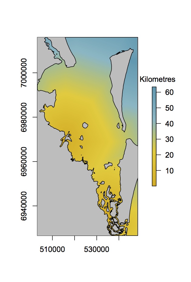
plot(r.riverdists, col =mycols)Interacting with plots
raster package is getting better all the time. One of the newer additions is many functions that allow you to interact with plots. For instance, try these (one at a time). You will need to click on the map to implement each function. Hit escape to exit the interactive mode.
plot(r.riverdists, col =mycols)
zoom(r.riverdists)
plot(r.riverdists, col =mycols)
click(r.riverdists,n=3)
plot(r.riverdists, col =mycols)
newpoly <- drawPoly() #hit escape to finish your polygon
plot(newpoly)
Another useful function for interacting with any type of plot is locator(n), it returns the n coordinates for where you haved clicked on a plot.
Look at characteristics of the rasters
It is good to explore you data, to understand rasters better. Try these
r.riverdists
projection(r.riverdists)
projection(r.sgutm)
res(r.riverdists) #resolution in x and y
nrow(r.riverdists) #number of rows
hist(r.riverdists[]) #histogram of distances
Project distances to local projections
You might have noticed that the river distances are not in our local UTM coordinates. We can reproject rasters, using projectRaster and specify the projection to be the same as the seagrass raster.
r.riverutm <- projectRaster(r.riverdists,r.sgutm)Let's open two figure windows and compare our projections
par(mfrow =c(1,2)) #set the number of figure subwindows, 1 row, 2 columns.
plot(r.riverdists, col =mycols)
plot(r.riverutm, col =mycols)
Notice that the UTM raster has also been cropped and resampled to the same extent and resolution as the seagrass raster. You can do cropping, aggregation and resampling yourself if you like.
We can draw a new extent on our new raster and crop to it
plot(r.riverutm, col =mycols)
drawExtent()
Below I have pasted in some coordinates (around the Brisbane river) I drew myself to the extent() function. The extent() function creates a new extent object that is basically just a box with a proj4string.
newext <- extent(510877.8, 524824.3, 6962493, 6979397)
r.bris <- crop(r.riverutm, newext)
plot(r.bris, col =mycols)
You might also want to aggregate cells in a raster. For instance, very large rasters with very fine resolution can be very slow to handle and use a lot of memory. Just use the aggregate() function to make them smaller. The fact=8 argument aggregates 8 cells in each direction.
ncell(r.riverutm)
r.riveragg <- aggregate(r.riverutm, fact=8)
ncell(r.riveragg)
par(mfrow =c(1,2))
plot(r.riverutm, col =mycols)
plot(r.riveragg, col =mycols)
Notice that if we increase the fact, the plot gets very blocky. We are trading off memory size for lower resolution. A similar function, that we won't cover today is resample(). Resampling changes the origin and resolution of a raster. In general you have to be a bit careful with all of these functions (reprojecting, aggregating, resampling), because they can sometimes distort the data in ways you don't intend, for instance the smaller islands dissappear when we aggregate.
Rasterizing
Rasterizing is turning spatial shapes (e.g. polygons) into rasters, it has nothing to do with Bob Marley. Let's rasterize our greenzones data onto the seagrass raster, so we can compare it to river distances.
?rasterize
r.greenzone <- rasterize(greenzones, r.sgutm, field='ID')
This copies the seagrass raster, clears its values and pastes in the values from the ‘ID' column of the spatial polygons data frame. Recall that ‘ID' was just a unique number for each MPA.
plot(r.greenzone)Now we have two rasters with exactly the same coordinates, resolution, cells etc… We can combine them in many different ways. For instance, we can get mean distances to rivers for each MPA.
zonal(r.riverutm, r.greenzone, fun='mean')This returns an array with zone numbers (the MPAs) and the mean distance of that MPA to rivers. You could also rasterize the greenzones by the areas field.
r.greenzone <- rasterize(greenzones, r.sgutm,field ='areas')
plot(r.greenzone)
Shows us a plot of MPAs, where colours represent their areas (minus the holes).
Write raster
Let's save where we are up to. Set your working directory to an appropriate folder then try
writeRaster(r.riverutm, 'River distances in utm.grd')Saves our raster (as a .grd. file). This can be reused later in R or imported into ARC GIS for instance, though I hope by now you are considering deleting all GIS programs from your computer and using only R from now on. Again, we can also write rasters for Google Earth. But remember it must be a raster with long-lat coordinates.
KML(r.riverdists, file='RiverDists.kml')Extracting data
To truly master spatial data manipulation in R, we need to know how to combine rasters and vectors. Luckily, this is pretty easy. For instance, let's find out whether seagrass is present or not at our video sites
?extract
sgpres <- extract(r.sgutm, datutm)
datutm$SG <- sgpres
extract() takes a raster (here our seagrass layer) and gets the values at a locations of spatial points (here our video sites). Again, the projections must be identical. Then we attached the results to our points dataframe. Now we are making some progress on matching our environmental variables with our video sites.
We can do the same for river distances
sitedist <- extract(r.riverutm, datutm)
datutm$rdist <- sitedist
datutm@data
Great! Now our points dataframe has presences of two species, presence of seagrass, MPAs and the distance to the nearest river, our proxy for water quality.
We can do some preliminary analyses to investigate how our species responsd to these variables. Let's do boxplots of river distances against our two species. You can try some other boxplots for yourself too
boxplot(datutm$rdist~ datutm$s.gilbii)
boxplot(datutm$rdist~ datutm$s.stevenii)
We can also calculate the proportion of sites where S. gilbii occurs on seagrass.
tapply(datutm$SG, datutm$s.gilbii,mean)tapply() takes a vector (SG), and applies a function (mean) by groups (S. gilbii presence/absence).
A primer on workflows
So far we have mainly been following my script without any view as to where we are going. With your own data, you will need to take more time to plan the workflow. Otherwise you can waste a lot of time and end up running down dead-ends, like eventually finding you have cropped a raster down too far. As an example of a simple workflow, let's revist the tasks we just did, but with the specific aim of extracting river distances and seagrass presence at video sites in mind.
So we have our sites data and we know it is in UTM coordinates: proj4String(datutm). We want to match our other layers to this layer. We might start a new script, and add comments as placeholders for tasks later, like this:
# Script to extract seagrass and river distances for video sites
# CJ Brown 27 Nov 2014
### Outline
#Load packages
#Load points data
# Load rivers and seagrass
# Check projections for rivers and seagrass
# Reproject rivers and seagrass if neccessary
# Extract points
# Add points to sites dataframe
# Save new sites dataframe for analysis later
Then we would start filling this in. For instance, assume you have read the data in already and are looking at rivers:
#...
#Check projection
proj4string(r.riverdists)
#It's not the correct UTM, reproject it
r.riverutm <- projectRaster(r.riverdists,r.sgutm)
#Plot to check it looks right
plot(r.riverutm, col =mycols)
#Extract points
sitedist <- extract(r.riverutm, datutm)
# And so on...
Planning like this can really help you save a lot of time by keeping you on track.
For Advanced users the dplyr package offers a cool function called pipes, which can make workflows easier to follow. Pipes look like this %>% and basically take the output of one function and port it into the first argument of the next function. As an example, lets reproject rivers then extract site values in one line.
library(dplyr)
sitedist <- r.riverdists %>% projectRaster(r.sgutm) %>% extract(datutm)
You could read this code as: 'take r.riverdists, project it using the CRS of r.sgutm then extract the values at the coordinates of datutm.
Advanced users - fitting a spatial model
A really powerful feature of R is that we combine its statistical packages with its pacakges for spatial data manipulation and plotting.
We now have our dataframe of species occurences and environmental variables. It is straightforwards to use that in a Generalized Linear Model to predict the probability of species occurences across the entire bay. We will do the analysis for S. gilbii here, I leave S. stevensii for later.
Fitting a model
First build a GLM using our data and include all the variables hypothesised to affect S. gilbii. We will use a binomial distribution for the errors, because we are dealing with presence/absences data.
mod1 <- glm(s.gilbii ~ SG + rdist + MPA, data = datutm@data, family = binomial)
summary(mod1)
I won't cover model building here, but in brief, the glm() function fits the GLM for us. It is saying predict ‘s.gilbii' using the variables ‘SG', ‘rdist' and ‘MPA' from the datutm@data dataframe. It looks like MPAs are not having a significant effect, but seagrass and distance to river are. Let's remove MPAs
mod2 <- glm(s.gilbii ~ SG + rdist, data = datutm@data, family = binomial)
summary(mod2)
Model 2 looks pretty good.
Plot predictions against factors
summary() gives us a table of coefficients, but it might be nicer to visualise the effects of seagrass and river distances on S. gilbii. Also, we fit a binomial model, so the coeffcients are on the logit scale. For interetating the output, we would prefer to visualise results as probabilities of occurrence. To do this, we first create a false dataframe that creates the values of predictor variables (SG and rdist) we would like to see probabilities for. We then use the predict() function to predict to those values. We can then make a plot of predictions.
Step 1: Predictor data frame
npreds <- 20 #number of predictions we want
distmax <- max(datutm@data$rdist) #maximum distance
pred.dists <- seq(0, distmax, length.out=npreds) #ordered sequences of distances
pred.dists
predSG <- c(0,1) #values of SG we want to predict to
dat.pred <- expand.grid( rdist =pred.dists,SG = predSG)
dat.pred
expand.grid() just makes a dataframe, but copies the ‘pred.dists', twice, once for SG=0 and again for SG=1.
Step 2: Predict probabilities for our new dataframe
dat.pred$fit <- predict(mod2, newdata = dat.pred, type='response')We just added a column of predictions for ‘mod2' to our dataframe, ‘dat.pred'. I specified ‘type=response' so we get probabilities, rather than values on a logit scale.
Step 3: Plot predictions
First identify the rows of dat.pred that are for seagrass and for without seagrass, so we can plot them separately
irow.none <- which(dat.pred$SG==0)
irow.pres <- which(dat.pred$SG==1)
Now we plot the no seagrass predictions first. We also set a few parameters for the plot, like axes labels and y limits.
plot(dat.pred$rdist[irow.none], dat.pred$fit[irow.none], type ='l', xlab ='Distance from river (km)',ylab ='Probability of presence', ylim =c(0,1))Now add the line for predictions with seagrass and add points for the original observations.
lines(dat.pred$rdist[irow.pres], dat.pred$fit[irow.pres], lty=2)
points(datutm$rdist, datutm$s.gilbii)
Finally, we might want to add a legend, so we now which line is which
legend('bottomright',legend=c('No seagrass','With seagrass'), lty=c(1,2), bg='white')Be careful with legend(), because it doesn't ‘look' at the plot like some programs to determine what to plot. In this case we tell it to add a legend in the bottom right, with two labels for seagrass using solid and dashed lines types (lty=c(1,2)), with a white background. If we accidentally swapped the line types (i.e. lty=c(2,1)), then the legend would be incorrect.
Plot a map for our data
R can be used to make publication quality maps. It does however take some playing around and you might be surprised in the end how long your script for making a plot becomes. I always am. The neat thing about using R to make your maps is that once you have your script, you can easily apply it to new datalayers or modify it. Having an R script for your figures in papers is particularly useful when you (or reviewers or coauthors!) decide you need to redo some analysis, which then requires replotting all the graphs. A good figure script will do all the re-plotting automatically.
So lets make a plot of our study region and some of the key observation data layers.
Plotting the rasters
We will build the plot up bit by bit, using the river distances as the first layer
plot(r.riverutm, col = mycols)Drag up the plot window so that you can really see your plot. The coordinates are a bit meaningless so lets get rid of them by telling plot() not to plot axes, using the argument xaxt='n'.
plot(r.riverutm, col = mycols, xaxt='n', yaxt='n')Now we can try to plot seagrass over the top
plot(r.sgutm, add=T)The add=T argument ensures we add this plot to the existing one. It doesn't look very good with seagrass though, because the seagrass layer covers the rivers layer. A solution would be to convert the seagrass raster to polygon, and just plot the outline of seagrass patches. We have converted polygons to rasters, by not rasters to polygons yet.
poly.sgutm <- rasterToPolygons(r.sgutm, fun=function(x){x==1}, dissolve=TRUE)There are a few unusual arguments here. The fun=function(x){x==1} command ensures we only draw polygons where there is seagrass (try rasterToPolygons without that and see how it looks). The dissolve=TRUE command dissolves neighbouring patches of seagrass into one polygon. If we didn't dissolve (i.e. dissolve=FALSE), we would get a heap of little square polygons, representing the outline of each raster cell with seagrass in it. Try it yourself. Now let's see how our seagrass polygons look
plot(r.riverutm, col = mycols, xaxt='n', yaxt='n')
plot(poly.sgutm, add=TRUE)
You might have noticed that the box around the figure is bigger than the raster itself, leaving an inelegent white space at the edges of the plot. We will fix this later.
Plotting shapefiles
It would also be nice to define an outline of the coasts. In the datasets folder I gave you is a folder ‘Moreton coasts' with a shapefile for the coast. Change your working directory to this folder and load the shapefile using readOGR() as before.
coastutm <- readOGR('.', 'coastutm')
plot(coastutm ,add=T, border='grey30')
We added coasts to the raster, using a light grey (‘grey30' means 30% of black) border. We can also add the greenzones
plot(greenzones, add=T, border='grey30')Then points for sites
points(datutm)It would be nice to see where we found S. gilbii. So lets replot our subset of points for where S. gilbi occurs. I made the colour ‘zissou.cap' earlier, but use a colour of your choice
points(dat.gilbii, pch=16, col=zissou.cap)Add a legend
We can add a legend for the points. This time we will put it outside of the figure box though, so we will specify its position using coordinates. We can find the placement using locator(1) and then clicking where we want the legend, to get the coordinates. Once you have your coordinates, use them in legend() like this
legend(x = 556366, y= 7016676, legend=c('Absent','Present'), pch=1)But notice that we can't see the legend (if you picked a location outside of the box). Plots in R are clipped to the plotting region (the box around the raster). The par() function allows us to control many graphics parameters. Try ?par to see a list. One of them is called xpd, and we can alter it to change the plotting region. Setting par(xpd=NA) lets us plot outside the normal figure region
legend(x = 552366, y= 7016676, legend=c('Absent','Present'), pch=c(1,16), col=c('black',zissou.cap))
text(565002.1, 7019015, 'S. gilbii', font=3)
The text() function adds some text (a title) to our plot too. The first two numbers are coordinates, and ‘font=3' makes italics. Make sure you reset xpd now, otherwise additional plots will go all the way to the edges of the window
par(xpd=F)Add an Arrow
Because this is a map, it would also be great to have an arrow showing north and a scale bar for context, so lets put some on.
Use locator(3) to find coordinates for the two ends of your arrow and the location for an ‘N'. Then we can make the arrow with an N like this
arrows(x0=513150, y0=6934468, x1=513150, y1=6949293, len=0.3)
text(513150, 6953621, 'N', cex=1.5)
x0, y0 etc… are the x and y coordinates for each end of the arrow. The len=0.3 sets the length of the arrow heads. ‘cex' is a pretty common graphical parameter, it is a scaling factor, in this case for the size of the N. Note our North arrow is approximate and will only be correct in the very centre of UTM zone 56. If we wanted the arrow to be correct everywhere, we would have to use an angle preserving projection, like lon-lat.
Add a scale bar
We can make a scale bar in a similar way to the arrow. Use locator(1) to find a place to start the line. Then decide on the length of your bar. I am going to go for 10kms, so I define a variable
scale.len <- 10000Remember that our coordinates are in meters? Now all we have to do is add scale.len to the x coordinate we just found, to make a bar exactly 10km long. Here are the coordinates I used
x <- c(518282, 518282+scale.len)
y <- c(6931187, 6931187)
Then we can plot them using lines, and add text to say how long it is
lines(x, y, lwd=4)
text(524025, 6929337, '10 km', cex=1)
This time in lines() I have set the parameter lwd which is the line width.
Putting it all together
We have our figure, so let's put it all together and save it as a pdf, to submit with a paper. You could just save it now using the menu in RStudio, but remember I said we would fix that ugly white space around the edges?
The best way to do it is to create a pdf and write the figure to that. We can set the width and height of the pdf. If we get the ratio just right, the box will fit nicely with the raster and there will be no white space (it does take some trial and error). To create a pdf, we use the pdf() function to create a pdf device. We can give the pdf a file name and set the width and height (in inches). Then we run our plotting code again, it will all be plotted to the pdf, so you won't see anything. Then to finish the pdf, we close it using dev.off() (meaning turn the figure device off). If you look in your working directory, you should see a pdf of the figure there. Here is the code we have put together for the figure
scale.len <- 10000
#Open the pdf device
pdf(file = 'SgilbiiMap.pdf', width=4, height=5.8)
# Plot rasters
plot(r.riverutm, col = mycols, xaxt='n', yaxt='n')
plot(poly.sgutm, add=TRUE)
# plot shapes
plot(coastutm ,add=T, border='grey30')
points(datutm)
points(dat.gilbii, pch=16, col=zissou.cap)
#Add the legend
par(xpd=NA)
legend(x = 552366, y= 7016676, legend=c('Absent','Present'), pch=c(1,16), col=c('black',zissou.cap))
text(565002.1, 7019015, 'S. gilbii', font=3)
par(xpd=F)
#Add the scale and north arrow
arrows(x0=513150, y0=6934468, x1=513150, y1=6949293, len=0.3)
text(513150, 6953621, 'N', cex=1.5)
x <- c(518282, 518282+scale.len)
y <- c(6931187, 6931187)
lines(x, y, lwd=4)
text(524025, 6929337, '10 km', cex=1)
#Finish the figure
dev.off()
Advanced users - plotting our model predictions
We can use the same ideas from mapping above, combined with the predictions for the probability of S. gilbii occurrences, to make a plot of were we expect to find S. gilbii.
Predict in space
We use predict again, but this time instead of predicting with a sequence of river distance values for seagrass, we predict with the rasters for river distance and seagrass presence.
To make our predictor variables, we just extract every value of the relevant raster layers
r.sgutm[]
predsg <- r.sgutm[]
predrdist <- r.riverutm[]
the [] gives us every value in the raster, starting at the top left and reading along rows. The two predictors will be extracted in the same order, so we can be confident they align properly, provided the resolution, extents are identical (which they are).
Now put the predictors into a dataframe and predict to that dataframe using model 2.
pred.df <- data.frame(SG = predsg, rdist= predrdist)
pred.df$fit <- predict(mod2, newdata = pred.df, type='response')
We just added a column of model fits to the dataframe. The model fits are the predicted probability of occurrence for S. gilbii. We can return those model fits to a raster for plotting, first create an empty raster that is the same as the original predictors (seagrass and river distances)
r.probs <- raster(r.sgutm)Then just assign the fitted values to that raster
r.probs[] <- pred.df$fitYou will notice we used the [] again, but this time on the left hand side of the assign symbol (‘<-'). This changes the values in that raster
Plot predictions
Plotting the predictions basically follows the same procedure as the last plot we made. The main change is that I decided to use a different colour palette. Here is my code for you to follow or customise to make the plot the way you want it.
probcols <- brewer.pal(9,'PuBu') #new colour palette
plot(r.probs, col = probcols, xaxt='n', yaxt='n') #plots predicted probabilities
plot(coastutm ,add=T, border='grey30')
#Add seagrass, as polygons
plot(poly.sgutm, add=T, border='DarkGreen', lwd=0.3)
plot(greenzones, add=T, border='grey30')
#Add an arrow
arrows(513150, 6934468, 513150, 6949293, len=0.3)
text(513150, 6953621, 'N', cex=1.5)
#Scale bar
scale.len <- 10000 #10 km
lines(c(518282, 518282+scale.len), c(6931187, 6931187), cex=3)
text(524025, 6929337, '10 km', cex=1)
We can see now that our species is unlikely to be near rivers, unless there is some seagrass there.
Conclusion
I hope you enjoyed the course and are convinced enough about R to keep using it for spatial applications in the future. The learning curve can be steep, but persistence will pay off. The best way to learn R is to go cold turkey on other programs. It will take you longer at first, but eventually you will get the hang of it.
Remember there is lots of help out there too, in terms of books, webpages, colleagues and mailing lists (although use these as a last resort). If you have a problem, some-else has also usually had it and there will be an answer out there. Often just doing a web search will turn up the answers you need. Finally, R is getting better all the time. I find that pacakges are improving so fast that problems I used to have just go away with the next update.
Finally, don't forget to fill out my survey (if I gave you one) or email me with feedback, so I can improve the course for next time.
Happy R using,
Chris
Appendix
Glossary
There are a few important programming terms to know. Here is a quick glossary, please refer back to it if you see a term you don't understand. I will explain more of these terms during the course.
* Assign
The assign symbol <- (AKA =) assigns a variable, like a number to a name like x. For instance to save the number one with the name x: x<-1, which you can read as 'assign x the number 1'.
* Class
A class defines a structure for an object. That way, when I give some data and say it is of ‘raster' class, you will know how it is structured and where to find different variables For instance, the extent.
* Console
The window where R code is executed.
* Function
A function takes some objects and changes them, returning a new object. For instance if we had a variable x of 20 numbers, we could calculate its mean using the mean() function like this mean(x). Some functions also have additional arguments. For instance, if we wanted to calculated the mean of ‘x' removing missing values (coded as ‘NA') we could write: mean(x, na.rm=T). Multiple arguments are separated by commas with a function's brackets.
* List
Lists are nested objects of more objects.
* Object
Anything you store in R's memory is an object. For instance, a string like this spatial a number like this 42 or even a new function. We will be working a lot with spatial objects today. See the entry for ‘lists'.
* Method
A single function can have multiple methods, if it works with different classes of objects. For instance plot(x) works with many types of data including arrays of numbers, rasters, polygons and even model objects. See the entries for functions, objects and classes.
* Packages
Packages are collections of functions that someone has written for distribution to others. The folder a package of functions is kept in is called its ‘library', hence we load packages to an R session using the library() function.
* Script
A window with a text editor where we write code so we can save it for later. The code in your script won't be exectued until you send it to the console (e.g. by clicking on a line and pressing Ctrl-R). The script should be written in the order you want the code to be executed. We're not writing Pulp Fiction so keep your code in chronological order.
* Variable
I use this term loosely here, in general a variable is just a number or sequence of numbers you have saved in R's memory.
* Working directory
The directory where R will look for any files you try to load. You can find out what it is by typing getwd() in the console. You can change it by typing setwd('/Users/cbrown/Databases), where the path is the path I use for databases. You need to change it to your own.