I’ve been playing around with Google Gemini Pro 3 (AKA Nano Banana) as a way to make science infographics. Here are the key lessons from my attempts.
I’m accessing the model via API calls with Python, example code is at the end. However, you could also do this via the chat interface.
For the record I’d still prefer to work with a human to create great infographics. A good designed will give you much more than just create the image, they will help you think through the key points and how most accurately to represent those. You’ll see below that I had some issues with scientific accuracy of the AI generated images. But I don’t have the budget for a designer on every project. AI images are good if you are clear on the key points you want to communicate.
Be clear on the key points of your study
Like any science communication its important to be clear on the key points that you want to communicate from the outset. Then tell the those key points in your prompt.
But, another approach is…
See what the AI comes up with
Just point the AI to your study using a web search. It is pretty good at simultaneously interpreting the key points from the abstract and then generated an image to go along with that. Here’s my first attempt:
Create a two panel infographic in cartoon style showing fisheries species that benefit from giant kelp restoration. In the left panel show small Ecklonia plants. In the right panel show giant kelp. Base the infographic on the recent study 'Predicting the impact of giant kelp restoration on food webs and fisheries production'. Include the 40x productivity boost. But don't include the numbers for the fishery species, just show which ones go up. Use bright colors and clear labels.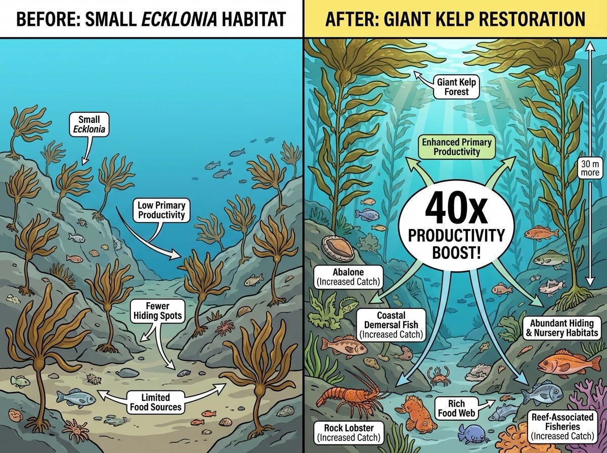
With the web search feature enabled the model can find the article via the title I provided in the prompt.
This looks pretty nice for a very simple prompt and the ‘40x’ stat is accurate to the paper.
However on closer inspection there are a few issues.
The fish look North American, our study was in Tasmania. The abalone are upside down.
The biggest issue is that the image implies there was a 40X boost in productivity to fisheries, which is not what we found. We found a 40x boost in kelp productivity that translated into 1-7% boost for fisheries.
Name a style
Its fun to play around with different styles. For the infographics below I tried ‘water colour style’ and ‘line-art botantical style’. You can get ideas for styles from lists on the web or a chatbot.
I don’t want the images to be too much like photos, I want it to be obvious that they are not ‘real’.
Some ideas for styles to mention:
- Cartoon (AI will choose its own style)
- Watercolour
- Botanical line-art
- Like ‘The Simpsons’ or your favourite cartoon. Just add “Don’t include any proprietary characters in the image” to avoid it using images that might violate copyright.
- Gothic
- Pencil sketch
- Manga
Or anything that is common enough the AI will know it.
Include reference images
Next attempt I tried a water colour style and I attached reference images of Tasmanian reef fauna to the prompt:
Create a two panel infographic in water colour style showing fisheries species that benefit from giant kelp restoration. In the left panel show a rocky reef with dense but small Ecklonia plants. In the right panel show a rocky reef with a healthy giant kelp forest. Include on the right panel the text: 40x kelp productivity boost. Include the animals in the reference images, showing more of them in the right panel. Redraw the animals to match the water colour style and so they look a natural part of the scene, but keep their essential morphological features intact. 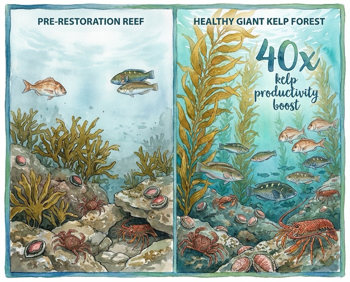
This looks more like a Tasmanian reef and is clearer that the 40x applies to kelp. But unfortunately the abalone are still upside down - I accidentally included an image of the abalone foot in my reference list.
The image also lacks context, so I wanted to try add some text in the watercolour style:
Update this infographic to add a sub-panel to the left hand panel that reads: 'Giant kelp forests have disappeared in many places, but are more productive than other algae. O'Neill et al. used models to predict how giant kelp restoration can enhance fisheries'. Adjust the composition so all text is clearly readable and the images are arranged in a balanced, visually appealing layout.I also corrected the reference image for abalone to only show the shell.
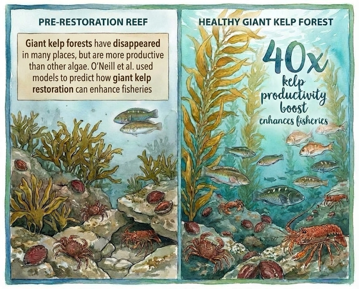
The coauthors and I were happy with this versio. I then just used powerpoint to add the DOI to the study as well as a statement: “Image: AI generated, human verified”.
I think people like to know what is generated by AI, but I wanted my audience to know that I had checked it for factual accuracy.
The more text the more likely there are to be errors
I had one more attempt with a study about mangrove restoration.
For this one I had the prompt:
Create an infographic in line-art botantical style explaining the following study for a general audience: ...Then I included the entire abstract in the prompt.
If you look closely you will notice lots of errors in the text.
Prompting with the study abstract didn’t work as well
The infographic based on the abstract was also too detailed for what I wanted. It would be better to go back to tip 1 (be clear on study outcomes) and just provide the AI with 1-3 key points to represent.
Leave space for post-production modifications
I’d like to be able to modify these easily by adding text boxes in powerpoint (I’m not sophisticated with image editing!).
My final tip is to ask the AI to leave a ‘white box’ in a certain position, that way you can add text to it later, making sure it is accurate.
Example python code
See the Google API reference for image generation.
Here’s the code I modified from there that uses reference images:
from google import genai
from google.genai import types
import os
from PIL import Image

from dotenv import load_dotenv
load_dotenv()

api_key = os.getenv("GEMINI_API_KEY")


prompt = "Create a two panel infographic in water colour style showing fisheries species that benefit from giant kelp restoration. In the left panel show a rocky reef with dense but small Ecklonia plants. In the right panel show a rocky reef with a healthy giant kelp forest. Include on the right panel the text: 40x kelp productivity boost. Include the animals in the reference images, showing more of them in the right panel. Redraw the animals to match the water colour style and so they look a natural part of the scene, but keep their essential morphological features intact. "
aspect_ratio = "5:4" # "1:1","2:3","3:2","3:4","4:3","4:5","5:4","9:16","16:9","21:9"
resolution = "1K" # "1K", "2K", "4K"

client = genai.Client()

response = client.models.generate_content(
    model="gemini-3-pro-image-preview",
    contents=[
        prompt,
        Image.open('gemini-api/reef-images/abalone.png'),
        Image.open('gemini-api/reef-images/crab.png'),
        Image.open('gemini-api/reef-images/ecklonia.jpg'),
        Image.open('gemini-api/reef-images/lobster.png'),
        Image.open('gemini-api/reef-images/trumpeter.png'),
        Image.open('gemini-api/reef-images/wrasse.png')
    ],
    config=types.GenerateContentConfig(
        response_modalities=['TEXT', 'IMAGE'],
        image_config=types.ImageConfig(
            aspect_ratio=aspect_ratio,
            image_size=resolution
        ),
    )
)

for part in response.parts:
    if part.text is not None:
        print(part.text)
    elif image:= part.as_image():
        image.save("gemini-api/reef-images/reef-scene3.png")