Conservation programming in R
Workshop for the Society for Conservation Biology Oceania
![]()
See the conference webpage for more info.
The workshop will be from 9am - 5pm on Monday the 4th July at The University of Queensland in Goddard Building, level 2 (room 217). Registration is essential and the course is fully booked.
Christopher J. Brown
July 2016
This workshop was supported by the Oceania Branch of the Society for Conservation Biology. Please consider joining to support more events like this and much more excellent work and advocacy that SCB does for conservation science.
Visit seascapemodels.org for more courses and info
Get the data for this course here
If you take this course, let me know about it on twitter or email, or if you like it, please recommend me on github or linkdin.
Introduction
The modern conservation scientist has to know a lot more about working with databases and data analysis than in the past. Conservation scientists are increasingly integrating a large variety of data-sets into their work. These analyses require matching data-sets that may have been entered in different ways, or cover different temporal and spatial scales. In today’s introductory course you will learn how R is nimble for data processing, checking for errors, visualising data and conducting analysis.
All of these procedures can loosely be termed data wrangling. What is data wrangling?
From Wikipedia: “Data wrangling is loosely the process of manually converting or mapping data from one ‘raw’ form into another format that allows for more convenient consumption of the data with the help of semi-automated tools”. Have you ever been faced with a dataset that was in the wrong format for the statistical package you wanted to use? Have you ever wanted to combine two data-sets for visualisations and analysis? Well data-wrangling is about solving these problems.
If you have to deal with large data-sets you may realise that data wrangling can take a considerable amount of time and skill with spreasheets programs like excel. Data wrangling is also dangerous for your analysis- if you stuff something up, like accidentally deleting some rows of data, it can affect all your results and the problem can be hard to detect.
There are better ways of wrangling data than with spreadsheets, and one way is with R.
It makes sense to do your data wrangling in R, because today R is the leading platform for environmental data analysis. You can also create all of your visualisations there too. R is also totally free. R is a powerful language for data wrangling and analysis because
- It is relatively fast to process commands
- You can create repeatable scripts
- You can trace errors back to their source
- You can share your wrangling scripts with other people
- You can conveniently search large databases for errors
- Having your data in R opens up a huge array of cutting edge analysis tools.
A core principle of science is repeatability. Creating and sharing your data scripts helps you to fulfill the important principle of repeatability. It makes you a better scientist and can also make you a more popular scientist: a well thought out script for a common wrangling or analysis problem may be widely used by others. In fact, these days it is best practice to include your scripts with publications.
Most statistical methods in R require your data is input in a certain ‘tidy’ format. This course will cover how to use R to easily convert your data into a ‘tidy’ format, which makes error checking and analysis easy. Steps include restructuring existing datasets and combining different data-sets. We will also create some data summaries and plots. We will use these data visualisations to check for errors and perform some basic analysis. Just for fun, we will finish by creating a web based map of our data. The course will be useful for people who want to explore, analyse and visualise their own field and experimental data in R. The skills covered are also a useful precusor for management of very large datasets in R.
The web map of fish abundance by sites that we will make at the end of today’s lessonThe main principles I hope you will learn are
- Data wrangling in R is safe, fast, reliable and repeatable
- Coding aesthetics for readable and repeatable code
- How to perform simple analyses that integrate across different data-sets
Let’s begin!
Programming to help save a species
Today we are going to work with an example data-set that has the abundance of a threatened fish species across sites with different fishing pressure. Our aim is to explore the data to see if the abundance is related to fishing pressure. We will also ask if fishing pressure is predicted by distance to fishing ports.
Then we will bring in some extra data on fish health, to see how that varies across the gradient in fishing pressure.
Finally, we will make a map of our results, and if you have time, look to see how proposed protected areas may benefit the species. But first, we need to learn how to get started with R.
Getting started with R
Install instructions
We will be using R from the platform RStudio today. If you haven’t installed both R and Rstudio on your computer yet, please follow these instructions. You will need to be connected to the internet.
Intro to Rstudio
R is a programming language, which means there are very few commands available in the menus, rather you have to type in commands into the ‘Console’ (notice there is a window called ‘Console’). The hard part about learning to use R is knowing what the commands are that you want and how to structure the commands in a way R understands. RStudio does however, ease the transition to programming by providing you with some drop down menus.
When you start up RStudio you should see a screen like this:

Background on basic calculations
In the console type
10 - 1And the console returns an answer (9). You have just asked the R program to compute this (easy) subtraction. Look carefully at the console and note that each line starts with a > this means the console is ready to take input. If you just type 10 - and hit enter, you will see the next line begins with a +, meaning the console is waiting for you to finish this equation. Type any number and hit return and you will get the answer followed by a >.
Tip: In this course
fixed width fontwith a grey background indicates code. You could cut and paste it directly into the console, but I suggest you type it out. Why? You will learn more. Typing it out helps you remember. It will also mean you will make mistakes and mistakes are a learning opportunity. Don’t be afraid to ask for help if something doesn’t work.
You can also ask the console for help, for instance try:
help('+')Notice a new ‘Help’ window opens up, with details of how to use arithmetic operators in R. These help files are very useful, but also tend to contain a lot of technical jargon. In learning to use R, you will begin to understand this jargon, making it much easier for you to learn more in the future. But to start off, if things don’t make sense at first reading, try web searches, referring to a beginners book or just experiment with code in different ways to see what happens.
R contains most functions and constants for maths you can think of, for instance try:
sqrt(9)
3^2
exp(1)
pi
Background on R objects
It is well and good to be able to do calculations in R, but what if we want to save our number and reuse it later?
That is what ‘objects’ are for. Try typing this into your console:
x <- 3^2Note that the console returns absolutely nothing, but it is ready for more input (>). Try typing x and the console reminds us that three squared in fact equals 9. To run through it point by point, the command we are giving says: compute 3^2 and assign (the assign command is this <-) the answer to x. The spaces around the assign don’t matter, you can leave them out. However, I prefer to have the spaces because it makes the code more readable. You may also see some people use = instead of <-. Both are ok, but for technical reasons that will be explained later, it is better to use <- for assigning values to variables.
If we want R to return the answer when the calculation is computed then enclose the sum in brackets like this (x <- 3^2).
Now, what if we try to recall an object that does not exist? For instance type y. R reminds us, in red font, that we never created an object called y.
Now we have created x we can use it in algebraic equations. For instance try z <- x*3 and you will see we get object z that equals 27.
We can also assign words to objects:
v <- 'today'Note that we enclosed our word in inverted commas. If we didn’t do this, R would try to assign the value of the object today to v.
A few tips on naming objects. You can name objects whatever you want (e.g. you could use nine instead of x), but there are a few rules: (1) you can’t use special characters in objects names (other than . and _) and (2) you must start an objects name with a letter. It is also a good idea to avoid naming objects as constants or functions that already exist in R, like pi, e, help.
Background on objects with multiple numbers
So far our objects only have one number. Note that when we recall a value, e.g. x the console prints [1] 9. The [1] means that the first number stored in x is 9. We can store more than one number or word in an object using the c() function:
 x <- c(22, 23, 24)
x
v <- c('yesterday', 'today', 'tomorrow')
Which creates objects each with three values. Note again I use spaces purely for clarity, they are not essential.
We can index objects to access certain numbers using []
x[1]
v[2]
returns the first value of x and the second value of v. We can also use indices to recall multiple values at once. For instance try
x[1:3]
x[]
x[c(1,3)]
Does the output make sense?
Background on logical indexing
We can also use logicals (TRUE/FALSE) for indexing. To see how this works, let’s pose R some logical questions
42 == 54
42 == 7*6
x[1] > 10
x[1] != 22
The relational operators used here ask questions such as 42 == 52 means ‘does 42 equal 54?’. To see more of them type help('=='). You will see they return TRUE or FALSE depending on whether the relation is true or false.
Logicals are very useful because we can use them for indexing. For instance
x>23returns a sequence of T/F, telling us that the first two values of x are not greater than 23 but the last value is. We can store this logical object and use it to return values of x that are greater than 23:
ix <- x>23
x[ix]
We can also apply this idea to words
iv <- v == 'today'
v[iv]
There are other specialised functions if you want to do partial searches for words (like grep()), but we won’t cover those in this basic course.
One final thing, if you don’t like the logicals, you can also use the which() function, which turns logicals into indices
ix <- which(x>23)
ix
x[ix]
ix tells us that the third value of x is greater than 23. x[ix] tells us that the third value of x is 24.
Scripts
So far we have just been typing everything into the console. However, we might want to save our commands for later. To do this go to the menu and select file -> New file -> R Script. It will open a text editor. From now on, type all your code into this editor. To send the code to the console for evaluation (ie to make R perform the calculations), click on a line, or select a section and hit ctrl-R on windows or cmnd-enter on mac.
We can put comments in the script (see image below), to remind us what it does. R will not evaluate comments, which are preceeded by an #. For instance, start your script by typing:
# R Conservation science course
# Your name
# 7 July 2016 
I recommend using comments frequently throughout your code. It will make life a lot easier when you come back to a piece of code after a few days, because the comments will remind you what the code does. It will also make it easier to share your code with collaborators and make your code more repeatable, which as I said, is a core principle of science.
Keeping your code organised also means you can translate it directly into the Methods section of your paper. This will save you a lot of time (because you won’t have to remember everything you did to get from data to analysis!).
Another way to make your code more readable is to break up sections of code within your script, for instance here is how I often delineate sections in my code
#-----------------------#
#   MAJOR HEADING     #
#-----------------------#

#
# Minor heading
#
Now we have a script with something worth saving, you should go to the menu and select ‘file’ -> ‘save as’ to save the script for later. Next time you come back to your analysis, you can just open this file, select everything and hit run. Then you will be back to where you left off last time. Further, you can share your script with other people or publish it with your paper.
Don’t forget what I said about repeatability and readability! It can take time to organise your script carefully, but it is worth it. I encourage you to include ample comments and section headers as we progress with the rest of the course.
Reading in data
Now we have started our script, let’s enter some code to read in some data. By entering this code into the script, rather than the console, we can save the work we do for later.
To start, we are going to make some visualisations from the dataset of fish surveys, dat.csv. This is a practice data set and is very small (only 40 rows). You might think wrangling this data would be easier in a spreadsheet, like excel. We will develop our wrangling skills on this small dataset but you can apply the same skills to much larger datasets that would be tricky to handle in a spreadsheet.
Some background on the data. dat.csv is what we call ‘tidy data’. Each row is an observation. Here we have multiple sites, each with four transects. We have five variables site, the names of sites, transect the transect number, abundances the abundance of fish at that transect and fishing an index of recreational fishing pressure.
To start playing with the data, the first step is to tell R where on your computer the data for this course is stored. We can set the working directory by typing this code into our script:
#
#DATA IMPORT
#
setwd('/Users/Documents/R_marine_science_course_data')
setwd() stands for ‘set working directory’. You will need to replace the folder path in the '' with the path on your computer. On windows you can right click on the file and select ‘properties’, on mac use ‘get info’, then cut and paste the path. Note that if you cut and paste on a windows computer you will have to replace the \ with /. I also have put a code header in here as an example. I won’t do this below, but I suggest you put in code headers for each new section we cover, it will make it easier for you to come back to this script later.
We can also set the working directory manually: In R studio go to the session menu, select ‘Set working directory’ then ‘Choose directory’ and navigate to the directory where the data for this course is stored on your computer. I recommend setting the working directory using code in your script, doing so will save time when you reopen R later.
We can see the files in this folder by typing list.files(). The first data we will use is called dat.csv and can be read in as a dataframe like this
fishdat <- read.csv('dat.csv', header = TRUE)
fishdat
If you typed the first line in correctly, nothing will happen in the console. This is true generally of R, unless you ask specifically for feedback (like plotting a figure), all the processing is internal and you see nothing. If you made a mistake, you will see some red text that explains the error (but often in very technical language).
Notice we used the assign operator again, but this time assigned the input data to the name fishdat.
read.csv is function that reads a csv file and stores it in R’s local memory. Functions are simply algorithms that R has stored, which perform a task for you, in this case reading a csv file. Functions always begin with a name followed by (), which contain some arguments. In the case of the read.csv() function, the arguments are the name of the data file (‘dat.csv’) and header = TRUE. The header argument simply says the first row is a row of variable names (so we don’t treat them as measurements). Also notice we use = to specify the function’s arguments. As I said above, it is best to use <- for assigning variable names and save = for function arguments.
If you need more help on any function in R type its name prefixed with a question mark, for instance ?read.csv.
By the way, remember what I said about typing the code in (don’t simply cut and paste from these notes). If you type it in, you will probably make mistakes. We can help you with those mistakes and thereby you learn more from this class!
In RStudio you should notice that the data now appears under the ‘Environment’ tab.

A note about Excel files
In short, don’t use .xlsx or .xls files for saving data. The problem with .xls and .xlsx files are that they store extra info with the data that makes files larger than neccessary and Excel formats can also unwittingly alter your data!
This kind of thing can really mess you up. A stable way to save your data is as a.csvwhich stands for comma seperated values. These are simply values seperated by commas and rows defined by returns. If you select ‘save as’ in excel, you can choose .csv as one of the options. Try opening the .csv file I have given you using a text editor and you will see it is just words, numbers and commas. Obviously using the csv format means you need to avoid commas in your variable names and values, because all commas will be interpreted as spaces between cells in the table.
As an example of the problems with excel files, type some numbers into an excel spreadsheet then click ‘format’ -> ‘cells’ and change the category to ‘time’. Now save it as a .csv and open it with a text editor. Your numbers have changed from what you typed in. Because excel automatically detects number types, if you enter something that looks like dates it might decide to change them all to dates and in doing so alter your data.
Accessing variables in the dataframe
The rules we learned above for accessing values of an object also apply to dataframes. A dataframe is a special ‘class’ of an object, where there are multiple variables, stored in names columns and multiple rows for our samples. Every variable has the same number of samples. A key difference from the objects we created earlier is that now we have both rows and columns. Rows and columns are indexed by using a comma as a separator. Try
fishdat[1,3]
fishdat[,2]
fishdat[1,]
fishdat[ ,c(1,3)]
We can also access objects in a data frame by their names:
fishdat$site
fishdat$abundance[1:4]
fishdat[,'transect']
Basic data summaries
We can get a summary of the data frame by typing:
head(fishdat) #first 6 rows by default
head(fishdat, 10) #first ten rows
Useful if the dataframe is very large!
Can you guess how you would print the last ten rows of a dataframe? Hint, flip a coin a few times and call out the side…
Note the () around the dataframe, as opposed to the [] we used for indexing. The () signify a function.
We can also do some statistical summaries. This is handy to check the data is ready in correctly and even to start some analysis. For instance:
nrow(fishdat)
mean(fishdat$abundance)
sd(fishdat$abundance) #standard deviation of abundances
table(fishdat$site) #number of transects per site
table(fishdat$transect) #number of sites per transect
Did you notice a mistake in fishdat?
Introduction to data visuals with ggplot2
In this course we will be using the ggplot2 package to visualise data. ggplot2 is an add-on toolbox for R that has to be loaded separately. To do this, navigate to the ‘Packages’ window in RStudio and click ‘Install’ type ‘ggplot2’ and then click ‘Install’ (you need to be connected to the internet). You only need to do this once.
Each time we open R we also need to load ggplot2 into our local session, so scroll down to ggplot2 and click the check box to load it in. Alternatively you can use the library command to load the packages automatically, see below.

Now we know our way around a few summarises, let’s turn the data into visualisations using ggplot2. Let’s look at a boxplot:
library(ggplot2)
ggplot(fishdat, aes(x = site, y = abundance)) + geom_boxplot() 
The library() command tells R to load in the package ggplot2. This is handy to have at the top of your scripts, to load in appropriate packages before analysis begins.
We will be using a lot of ggplot today, so you might like to download RStudio’s ggplot cheatsheet for reference.
Now we are ready to make a graph. Type this into the console: The function ggplot() creates a graph, rather than returning data like the other functions we have seen. You can read the above line as: Take fishdat, create an aes (aesthetic) where the x-axis is sites and the y-axis is abundances, finally add (+) a boxplot.
The ‘gg’ in ggplot stands for grammar of graphics. The intent is to turn a sequence of functions into a readable sentence, which is why we separate too different functions (ggplot() and geom_boxplot()) with a +. You can combine different functions into different sequences to create different types of graphics.
So, what is the error in our data?
Yes, R distinguishes between upper and low case, so it is treating sites b and B as different sites. They are meant to be the same. We will find out how to correct this typo in a moment. But first, we need to locate its position.
Locating particular values
We can locate the indices for certain values using logical relations, for instance
fishdat$site == 'A'Returns a sequence of TRUE and FALSE, with the same number of rows as the dataframe. TRUE occures where the site is A and FALSE where the site isn’t A. The double equals above is used to ask a question (ie is site A?). If you prefer row indices to T/F, you can enclose the logicals in the which() function:
which(fishdat$site == 'A')So the first five rows are site A. There are other sorts of logical quesions for instance:
which(fishdat$site !='A')
which(fishdat$fishing > 6.01)
which(fishdat$fishing >= 6.01)
Correcting mistakes in data frames
Earlier we noticed a typo where one transect at site ‘B’ was mistakenly typed as site ‘b’. We should identify which ‘b’ is wrong and correct it.
ierror <- which(fishdat$site == 'b') #Find out which row number is wrong
fishdat$site[ierror]
fishdat$site[ierror] <- 'B' #Change it to the correct upper case.
We could also have used the toupper() function to change the case of ‘b’ (or infact the case of every value in site). You might be thinking, ‘I could have easily changed that error in a spreasheet’. Well you could have for a dataframe with 40 observations, but what if the data had 1 million observations?
We have to correct one last error in fishdat. Because fishdat was read in with a little b, the ‘levels’ for the sites will still include a b, even though none of the sites now have that name (you can think of this as meta-data describing the unique site codes). To see this error, and fix it, take the following steps:
table(fishdat$site)
fishdat$site <- droplevels(fishdat$site)
table(fishdat$site)
Notice that after we used droplevels() (which drops the empty level b), the table did not include the zero count for b.
Let’s check the boxplot to see that the two B sites have now be merged:
ggplot(fishdat, aes(x = site, y = abundance)) + geom_boxplot()
Saving our corrected data frame
Now we have corrected our dataframe, we may want to save it for later. We can do this with write.csv() which is basically the opposite of `read.csv()
write.csv(fishdat, 'dat_corrected.csv', row.names = FALSE)Which saves a new csv file to our current working directory (have a look in your folder and you should see it there). If you want to know what your current working directory is, type getwd().
More on graphs
Lets do a few more graphical summaries. Try these
ggplot(fishdat, aes(x = abundance)) + geom_histogram(binwidth = 3)
See what happens if you change the binwidth parameter.
ggplot(fishdat, aes(x = fishing, y = abundance)) + geom_point()
Which plots a histogram and an xy plot of fish abundances against the fishing index at each transect. Note each command starts similarly (using ggplot(fishdat...) but ends with a different geom command. Looks like there is a relationship. We can improve our plot slightly by using some extra arguments to plot()
ggplot(fishdat, aes(x = fishing, y = abundance)) + geom_point(size = 5) +
  ylab('Fish abundance') +
  xlab('Fishing pressure index')
Here we inserted a new command into geom_point() to change the point size, then we also added axes labels.
In fact, a whole host of graphical parameters you can manipulate. See the R Graphics Cookbook or the ggplot2 webpage for more help. As a final step, we could colour the points by site, by adding a colour command to the aes() function and then change the legend title using labs():
ggplot(fishdat, aes(x = fishing, y = abundance, colour = site)) + geom_point(size = 5) +
  ylab('Fish abundance') +
  xlab('Fishing pressure index') +
  labs(colour = 'Sampling sites')
Tip: If you don’t like the grey background on the plot, try adding this to your ggplot command:
+ theme_bw(). This will create plots with a white background. You can also install and load thecowplot()package, which will change all of ggplot’s themes to a black and white default, ready for publication.
Loading data wrangling packages
Many users of R also develop add on packages, which they then share with the world. Today we are going to use some packages that make data wrangling easy. First you need to install them to your computer, as we did above for ggplot2 (you will need a web connection to do this). Today we need the tidyr (for tidying dataframes) and dplyr (‘data pliers’) packages. Once you have installed these, you need to load them for each new R session like this:
library(tidyr)
library(dplyr)
The red warning just means some functions in R’s base packages have been replaced with those in dplyr, nothing for us to worry about here.
RStudio also has a handy cheatsheet for data wrangling that you might like to download before we continue.
All the operations we will perform in tidyr and dplyr can be done using R’s base packages. However, we are using these special packages because they make data wrangling easy, intuitive and aesthetic. Remember I said that a good script can make you a popular scientist? Well dplyr and tidyr are good examples of that. They do some tasks we could do already in R but makes them easier and faster.
If you have trouble loading tidyr or dplyr, it may be because your version of R is not up to date. If you have troubles, please update both R and Rstudio if you are using that too.
Filtering a dataframe using dplyr
We can filter a dataframe with dplyr to say, just get the rows for one site
fish_A <- filter(fishdat, site == 'A')
fish_A
Which says, take the fishdat dataframe and filter it for rows that have site=='A'. One way this could be useful would be to help us make a plot of just the transects at site A, for instance
ggplot(fish_A, aes(x = fishing, y = abundance)) +
  geom_point(size = 5) +
  ylab('Fish abundance') +
xlab('Fishing pressure index') 
Summaries using dplyr
Summarising data is straightforward with dplyr. What follows is somewhat similar to making a pivot table in excel, but without all the clicking. First we need to specify what we are summarising over, using the group_by() function
grps <- group_by(fishdat, site)
grps
grps is similar to the orginal data frame, but an extra property has been added ‘Groups:site’. Now we have specified a grouping variable, we can summarise() by sites, for instance the mean values of fishing pressure and fish abundances
summarise(grps, meanFN = mean(fishing)) #just fishing pressure
summarise(grps, meanF = mean(fishing), mean_abund = mean(abundance)) #means for fishing and abundance
Here is what our data summary looks like
## Source: local data frame [10 x 3]
##
##      site  meanF mean_abund
##    (fctr)  (dbl)      (dbl)
## 1       A 3.5000       4.50
## 2       B 3.1675       8.25
## 3       C 2.6575      12.00
## 4       D 1.0900      28.50
## 5       E 1.8450      18.75
## 6       F 2.0775      17.00
## 7       G 2.0650      15.00
## 8       H 2.9100       9.25
## 9       I 2.5125      12.25
## 10      J 3.2850       5.75
You could summarise using all sorts of other functions, like sd() or min(). Try it for yourself.
Let’s store our new data summary, add the sd, then use its variables in some plots
datsum <- summarise(grps, meanF = mean(fishing), mean_abund = mean(abundance), sdF = sd(fishing), sdabund = sd(abundance))First we make the base plot of all data. We do something different here however, we are going to save the plot as an object itself:
p <- ggplot(datsum, aes(x = meanF, y = mean_abund, color = site)) +
  geom_point(size = 3) +
  ylab('Fish abundance') +
  xlab('Fishing pressure index')
Notice nothing happens. We have stored the plot in the object p. If we type p the plot will be printed to the screen. What we want to do now is add some lines for the standard deviations:
p +
  geom_errorbar(aes(ymin = mean_abund - sdabund, ymax = mean_abund + sdabund))
Notice that we have added a new geom_errorbar() to our object p. We have coloured the sites and lines indicating the standard deviation. Can you figure out how to add bars for the sd of fishing on the x-axis too? Hint: you will want to use the geom_errorbarh() geom.
Aesthetics in multi-line coding
Notice that we just did a series of data-wrangling steps. First we identified groups then we created some summaries. We could write this code all on one line like this
summarise(group_by(fishdat, site), meanF = mean(fishing))Which will return the same summary as above. But, notice we have nested a function inside a function! Not very aesthetic and difficult for others to follow. One solution would be to do the code over multiple lines, like we did above
grps <- group_by(fishdat, site)
summarise(grps, meanF = mean(fishing))
One clever thing that the creaters of dplyr did was to add data ‘pipes’ to improve the aesthetics of multi-function commands. Pipes look like this %>% and work like this
fishdat %>% group_by(site) %>% summarise(meanF = mean(fishing))Pipes take the output of the first function and apply it as the first argument of the second function and so on. Notice that we skip specifying the dataframe in group_by() and summarise() because the data was specified at the start of the pipe. The pipe is like saying, take fishdat pipe it into group_by(), then pipe the result into summarise(). Now our code reads like a sentence ‘take fishdat, do this, then this, then this’. Rather than before which was more like ‘apply this function to the output of another function that was applied to fishdat’.
Joining dataframes
Our fish abundances and fishing pressure aren’t the end point of our data analysis. We also want to know how they relate to some variables we measured at each site. To see these load
sitedat <- read.csv('Sitesdat.csv', header = TRUE)
sitedat
dplyr has a range of functions for joining dataframes. All are prefixed with join. Here we use the inner_join() to find out about the others look at the help file (?inner_join)
datnew <- inner_join(fishdat, sitedat, by ='site')
datnew
We have joined fishdat and sitedat by their common variable site. Notice the join automatically replicates distance and depth across all the transects, keeping the dataframe ‘tidy’. One analysis we could do is plot the fishing pressure values, fishing against distance to ports, distance.
p2 <- ggplot(datnew, aes(x =distance, y = fishing, colour = site)) + geom_point(size = 4)
p2
Looks like the fishing pressure index source is higher closer to the ports. Note we saved the plot as an object again. That is because we will come back to modify it later.
As a challenge, can you think of a way of plotting the mean values of fishing at each distance? Can you add error bars?
Formal analysis
Visuals are great, but we might also like to know what the line of best fit looks like and if it is signficant. We can fit a linear model of fishing versus distance using the lm() function:
lm(fishing ~ distance, data = datnew)##
## Call:
## lm(formula = fishing ~ distance, data = datnew)
##
## Coefficients:
## (Intercept) distance
## 4.019 -0.098Which tells us the slope (=-0.098, under the column distance) and the intercept. One way to check if the slope is significantly different from zero is to use summary. First we save the lm() as an object, mod1 then we apply the summary() function:
mod1 <- lm(fishing ~ distance, data = datnew)
summary(mod1)
##
## Call:
## lm(formula = fishing ~ distance, data = datnew)
##
## Residuals:
## Min 1Q Median 3Q Max
## -0.61801 -0.26524 -0.00791 0.17079 1.08876
##
## Coefficients:
## Estimate Std. Error t value Pr(>|t|)
## (Intercept) 4.019268 0.136877 29.36 < 2e-16 ***
## distance -0.097997 0.008084 -12.12 1.25e-14 ***
## ---
## Signif. codes: 0 '***' 0.001 '**' 0.01 '*' 0.05 '.' 0.1 ' ' 1
##
## Residual standard error: 0.3608 on 38 degrees of freedom
## Multiple R-squared: 0.7945, Adjusted R-squared: 0.7891
## F-statistic: 146.9 on 1 and 38 DF, p-value: 1.254e-14summary() returns a table of statistics about the linear model fit. Some key points. The ‘Estimate’ column shows the best fit estimates of the intercept and slope (on distance). Standard errors for the estimates are also shown, along with t-values and p-values. The p-value for the intercept is not very useful, because it is tesing for a difference from zero. The p-value on the slope (distance) is more interesting. It is less than 0.05, so there is a signficant statistical relationship between distance and fishing pressure.
Another useful piece of information in the summary is the R-squared value, which is printed at the bottom. An R2 of 68% is quite high for ecological relationships. Also note the degrees of freedom. We have 40 samples and we fitted a two parameter model (slope and intercept), leaving us with 38 degrees of freedom. This high degrees of freedom might raise our suspicions about psuedo-replication, because we only had 10 sites. In a complete analysis, we might consider including a random effect for the sites. I will leave that task to another course though.
A note about statistical versus biological significance
I was careful above to state that the relationship is signficant statistically. This does not mean it is necessarily biological signficant. There are two more considerations before we call it a biologically significant relationship.
First, could the relationship be spurious? We should ask is there a plausible reason why distance from ports would cause a change in fishing pressure; and what other evidence is there that fishing would relate to distance? In this case, we have such a reason: people don’t like to travel too far.
Second, is the magnitude of the change in fishing biologically signficant. In this case it is hard to tell, because the measure of fishing is a unitless index. We will do some more analysis to see if fishing predicts abundance of the threatened fish species. To read more about statistics and causation, see my blog post on statistics and causation.
Now we have our summary, lets add the line of best fit to the plot. But first, try typing
mod1$coefficients## (Intercept) distance
## 4.01926754 -0.09799672see that this command returns the coefficients. Notice the use of the $ which we also used to access variables in the data frame. Model objects are similar to dataframes in that we can access their output by using $ and then the variable name. A key difference however is that not all variables in the model have the same length. For instance type mod1$residuals. You can see all the variables in mod1 by typing names(mod1). It is handy to be able to access the model coefficients directly, because we can re-use them in a our plotting command to draw a line. Then, if we have to update the dataset later, the plot will be automatically updated too. Here is how we add the line of best fit:
p2 + geom_abline(intercept = mod1$coefficients[1], slope = mod1$coefficients[2])
We can see that the fishing pressure declines with distance from ports. Let’s walk through that code a bit more. We took the plot object we had already created p2 and added an abline with geom_abline(). For the abline, we specified a slope and intercept, taking these values from the model object we created.
A tip for quickly viewing lines of best fit
If you want to just quickly view the line of best fit and don’t need the table of summary statistics, ggplot() can plot the line directly for you. You can even add shading for the standard error bars. Here is how:
p2 + stat_smooth(method = 'lm', se = T, aes(group =1))
The stat_smooth() function takes the x and y variables from p2 and fits a model to them using the lm function. To see other options type ?stat_smooth(). We have also asked for standard errors (se=T). The aes() command avoids an error that occurs when we have multiple y measurements for the same x-value.
Tidying messy data
We have yet more data. Our physiologist collaborator has helped us out and taken three fish of different sizes from each site (small, medium and large) and run some tests to generate an index of fish ‘condition’ or health. We want to know if some areas have healthier fish than others, to help us plan our marine reserves.
Let’s look at the data
fishcond <- read.csv('FishCondition.csv', header = TRUE)
fishcond
## X A B C D E F G
## 1 small 3.927791 3.766107 3.690489 5.691263 4.259945 5.662702 4.533392
## 2 medium 4.770274 2.813460 NA 5.056535 4.857173 4.144030 5.183397
## 3 large 2.216580 3.537258 2.903821 5.124893 3.200245 3.782602 3.950908
## H I J
## 1 3.579769 4.553699 3.400081
## 2 1.895479 3.083308 3.338051
## 3 4.523674 3.241638 4.081899It seems our collaborator was not familiar with the ‘tidy data’ format. This will hinder analysis and graphing, so we need to wrangle it into a tidy format. Notice that values for fish condition at each site are stored as separate columns. We will need to tidy this data if we are to proceed. Luckily we have the tidyr() package handy and one function gather() will be particularly handy here. Check out the vignettes other useful functions to tidy data
(condtidy <- gather(fishcond, site, condition, A:J))## X site condition
## 1 small A 3.927791
## 2 medium A 4.770274
## 3 large A 2.216580
## 4 small B 3.766107
## 5 medium B 2.813460
## 6 large B 3.537258
## 7 small C 3.690489
## 8 medium C NA
## 9 large C 2.903821
## 10 small D 5.691263
## 11 medium D 5.056535
## 12 large D 5.124893
## 13 small E 4.259945
## 14 medium E 4.857173
## 15 large E 3.200245
## 16 small F 5.662702
## 17 medium F 4.144030
## 18 large F 3.782602
## 19 small G 4.533392
## 20 medium G 5.183397
## 21 large G 3.950908
## 22 small H 3.579769
## 23 medium H 1.895479
## 24 large H 4.523674
## 25 small I 4.553699
## 26 medium I 3.083308
## 27 large I 3.241638
## 28 small J 3.400081
## 29 medium J 3.338051
## 30 large J 4.081899The tidy data looks much better. What gather() has done is take the fishcond dataframe, creating new variables site and condition and made them from the values in columns A to J.
Notice the NA for the medium fish at site B. Unfortunately, we couldn’t catch a fish of that size at site B. We have encoded the missing value as NA when we entered the data. NA is the correct way to indicate a missing value to R.
Let’s rename the first column too:
condtidy <- rename(condtidy, size = X)Now we have tidy data, let’s do boxplots by fish size and site. Note that below we add a fill = ... command. This just makes the boxes pretty colours.
ggplot(condtidy, aes(x = site, y = condition, fill = site)) + geom_boxplot()
ggplot(condtidy, aes(x = size, y = condition, fill = size)) + geom_boxplot()

If you can’t see both plots, click the back arrow at the top of the window to scroll through them. Type ?geom_boxplot() if you are not sure what the boxes and whiskers correspond to. In short however, the boxes (‘hinges’) are 25% and 75% quantiles and the whiskers represent a wider range and the points potential outliers. We can see from these plots that condition varies by sites, but not much by size.
Summaries with missing values
Let’s create a summary of our new fish condition data, using our new piping skills.
fishc_mn <- condtidy %>% group_by(size) %>%
   summarise(meanC = mean(condition))
fishc_mn
## Source: local data frame [3 x 2]
##
## size meanC
## (fctr) (dbl)
## 1 large 3.656352
## 2 medium NA
## 3 small 4.306524Which says, take condtidy, group it by size then make a summary of mean values for condition. Well we get the means, but not for the size category with the missing value. Why? R’s default setting for taking a mean across an object with a missing value is the return NA. R does this to make sure we are aware there are missing samples (and therefore, our sampling design is unbalanced). We can change this default behaviour however, and ask R to ignore the NA by adding the argument na.rm = TRUE
fishc_mn <- condtidy %>% group_by(size) %>%
  summarise(meanC = mean(condition, na.rm = TRUE))
fishc_mn
## Source: local data frame [3 x 2]
##
## size meanC
## (fctr) (dbl)
## 1 large 3.656352
## 2 medium 3.904634
## 3 small 4.306524We have our mean for the medium fish, but be aware, it was taken from only three sites. Let’s also do some means by sites (across sizes)
sites_cond_mn <- condtidy %>% group_by(site) %>%
  summarise(meanC = mean(condition, na.rm = TRUE))
sites_cond_mn
Bringing it all together
Now we have combined all our data frames, let’s see if we can plot fishing versus fish condition and distance versus fish condition.
datall <- inner_join(sitedat, sites_cond_mn, by = 'site') %>%
  inner_join(datsum, by = 'site')
If you don’t understand this code, try running it a bit at a time to see what the output is.
Now lets put it all together in a plot
ggplot(datall, aes(x = meanF, y = meanC, colour = site)) +
  xlab('Fishing pressure index') +
  ylab('Fish Condition') +
  geom_point(size = 5)
What does this suggest about the effect of fishing on fish condition?

ggplot(datall, aes(x = mean_abund, y = meanC, colour = site)) +
  ylab('Fish condition') +
  xlab('Abundance') +
  geom_point(size = 5)
What about this graph? It is always worth investigating alternative hypotheses.

Just for fun: an interactive web map
For our last task I want to show you how you can make some really cutting edge visuals with R, which will help you share your work with collaborators. We are going to make a simple web-based map using the leaflet package. The leaflet package utilises the open-access leaflet JavaScript library (a web programming language), to create web-based maps . We will cover a basic map with some points on it today. See Rstudio’s leaflet page for help and more mapping features, like polygons.
To get started with leaflet, first, make sure you have the leaflet package installed, and then load it into this session:
library(leaflet)Now, make sure you are connected to the internet.
We will aim to make an interactive map of our study sites and the abundance of fish at eah site
The leaflet package works a lot like ggplot. We start by specifying a base layer, then we can add features to it. We will string together our layers using the pipes (%>%), much like the + operator we used with ggplot. The below code first creates a map widget using the datall data frame. Then we add ‘tiles’, which is the background to the map. See this page for the numerous tile options. Finally, we add some markers, located using the long and lat variables in the sitessg dataframe:
leaflet(datall) %>%
  addTiles() %>%
  addMarkers(~long, ~lat)
And you should see a map (assuming you are connected to the internet!) like the one above. Now let’s add a few features. First we will assign (<-) our map to an object sites_map, so we can save it for later. We will use a different set of tiles this time, which will show us satellite images. We will also add circle markers, scale their radius by fishing abundance at a site and add a popup for the site names.
sites_map <- leaflet(datall) %>%
  addProviderTiles("Esri.WorldImagery") %>%
  addCircleMarkers(~long, ~lat, popup = datall$site,
                   color = 'white', opacity = 1,
                   radius = datall$mean_abund)
Type the new leaflet object’s name to view the map in Rstudio:
sites_mapIf you want to keep the html and javascript files for later, then load in the htmlwidgets package, and you can save all the code required to re-create your map on your webpage:
library(htmlwidgets)
saveWidget(sites_map, file = 'SurveySites.html' , selfcontained = F)
These files are ready to be uploaded to your web server, and then you can share this map with the world.
If you would like to learn more about GIS and mapping in R, then checkout my free course: mapping in R.
Advanced task: Protected area coverage analysis
Based on our analysis we have convinced the government and the public there should be some new marine protected areas implemented to protect our threatened fish species. But where should we put them? We want to go back to government with a proposal that has a solid chance of protecting this species.
We don’t have any more money for field surveys just yet. But we can estimate the abundance of our species across a range of plausible reserve sites using just information about distance from fishing ports. This might help us prioritise our field surveys for confirming the sites have the species, or help us in choosing sites to argue for protection. ’ Our GIS assistant has come up with a list of possible sites and provided their distances from ports and depth. Can you predict the fishing pressure at those sites and the abundance of the species?
First load in the data:
mpasites <- read.csv('MPAsites.csv', header = TRUE)Now let’s do a quick check of the data, in by looking at a histogram
ggplot(mpasites, aes(x = distance)) + geom_histogram(binwidth =1)Can you spot a mistake in the data? Can you correct it?
Yes there is a negative distance. It’s probably meant to be a positive value, so for now let’s switch it. We should make a note though to follow up with our GIS expert who made the data with us.
isneg <- which(mpasites$distance<0)
mpasites$distance[isneg] <- abs(mpasites$distance[isneg])
We just identified which value was negative using which() then converted it to a positive value using the absolute value function abs().
It will be useful to know the fishing pressure and abundance at our sites proposed for protected areas. We can used our fitted model from earlier to predict fishing pressure like this:
mpasites$pred_fishing <- predict(mod1, newdata = mpasites)
ggplot(mpasites, aes(x = distance, y = pred_fishing)) +
  geom_point() +
  xlab('Distance (km)') +
  ylab('Fishing pressure, predicted')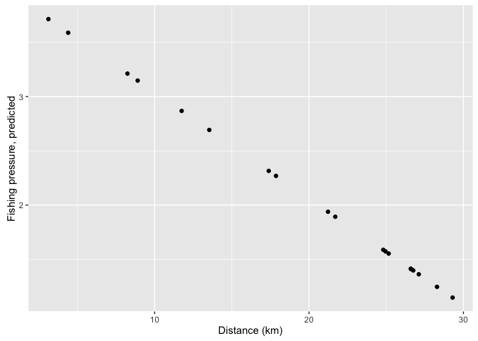
We can also predict abundance at the different sites. To do this we need to build another model that relates abundance to distance in the original dataset, then predict it to the new dataset.
A trick here is that abundances only take integer values. Therefore our normal lm() function that does regression would be inappropriate, because that predicts numbers that can be fractional. We can fit an abundance model using the glm() function:
moda <-glm(abundance ~ distance, family = 'poisson', data = datnew)The Poisson distribution is appropriate for count data. Now we can predict back to our sites proposed for MPAs:
mpasites$pred_abund <- predict(moda, newdata = mpasites, type = 'response')
ggplot(mpasites, aes(x = distance, y = pred_abund)) +
  geom_point() +
  xlab('Distance (km)') +
  ylab('Predicted abundance')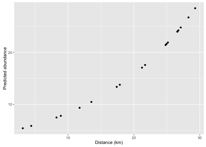
Notice that the predictions can take fractional values. This is because the predictions are for the average abundance (which can be fractional).
Finally, we can ask how many fish we would expect to protect on average if we protected a subset of sites. To do this, first create some new variables that indicate whether each site will be proteced or not. We will create two variables, on for protecting four sites nearby to ports and one for protecting four faraway sites.
mpasites$protect1 <- c(1,1,1,1,0,0,0,0,0,0,0,0,0,0,0,0,0,0,0,0)
mpasites$protect2 <- c(0,0,0,0,0,0,0,0,0,0,0,0,0,0,1,1,1,1,0,0)
We have indicated with a 1 the sites we want to protect and a 0 those that won’t be protected. Note that our new variable must have 20 values so it fits into the mpasites dataframe.
Now we can estimate abundance protected for this arrangement of protected areas by multiplying and summing predicted abundance with the protection indicator:
sum(mpasites$protect1 * mpasites$pred_abund)## [1] 28.37585sum(mpasites$protect1 * mpasites$pred_abund) / sum(mpasites$pred_abund)## [1] 0.08126005sum(mpasites$protect2 * mpasites$pred_abund)## [1] 94.29331sum(mpasites$protect2 * mpasites$pred_abund) / sum(mpasites$pred_abund)## [1] 0.2700282So picking the first four sites for protection would protect on average 28.4 individuaor about 8% of all individuals at the 20 sites. Picking the four faraway sites would protect on average 27% of individuals.
Some people have argued that coverage of a species isn’t a good metric of protection, because maybe you are just protecting individuals that would not have been affected by fishing anyway. Therefore, can you think of a way to calculate how much fishing pressure the two protection schemes might avoid? This might give us a better idea of how much real protection we achieve. Even better, can you predict how much higher fish abundance would be if there is no fishing in each area?
Conclusion
I hope I have convinced you of how useful R can be for data wrangling, analysis and visualisation. R might be hard at first, but the more you use R the easier it will become. If you can use R you will find data management much more straightforward and repeatable. Aim to write aesthetic scripts and you can avoid many head-aches when you realise there are errors in your database- with a neat script you can trace back to the problem and correct it.
R programming is a skill that take times to learn. But I believe it is worthwhile. Being good at R, helps you create repeatable work, will make you a sought after collaborator and a better scientist.
My notes from the course are available here
If you took this course, let me know about it on twitter or email, or if you liked it, please recommend me on github or linkdin.