5 Sketching your model: from whiteboard to equations
Start at a whiteboard with boxes and arrows. Do it with a collaborator or supervisor; it is more fun for the company.
5.1 Draw the diagram first
Begin by drawing. Boxes usually stand for variables or states, and sometimes for parameters. Arrows stand for causes: the tail is the cause, the head is what it affects. Read an arrow as an equation. The variable at the tail sits on the right-hand side, the arrow is the equation itself, and the variable at the head is what the equation resolves to. Draw the whole model this way and it tells you what equations you need and what data you must collect. Later you attach equations to the arrows.
5.2 Use your field’s diagram conventions, or make your own
Most kinds of modelling already have a diagram convention, usually designed that way for a reason, so use it.
Here’s a couple of examples:
- Statistical modelling uses a DAG, a directed acyclic graph: a diagram with no loops, so no variable feeds back to affect itself (directly or indirectly). For example, a dependence across time (a variable affecting its own future value) is drawn as two boxes, t and t+1, with an arrow between them.
- Qualitative modelling uses loop diagrams, which do contain loops. A plain arrow marks a positive effect; an arrow with a circle head marks a negative one.
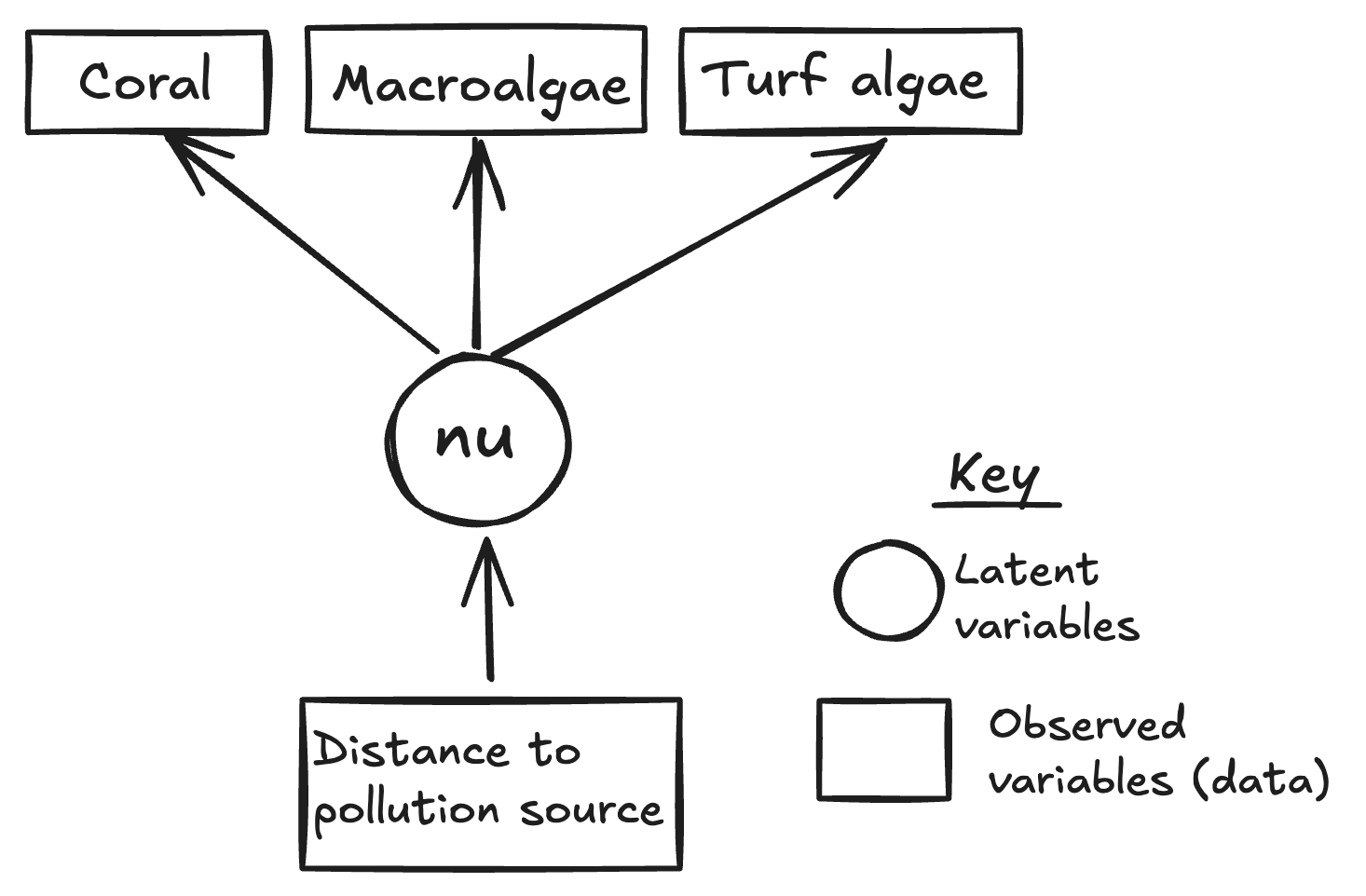
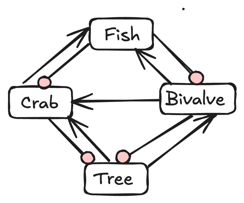
Where no convention exists, invent one. That is fine, as long as it is a consistent system you can defend. Keep your equations, parameter and variable definitions internally consistent with it, and update the convention as your representation changes.
If no convention exists, the visual vocabulary is yours to set: colours, box shapes, and arrow types for different kinds of cause and effect. In statistical diagrams, for example, observed data are often squares, latent (unobserved) variables circles, and parameters or hyperparameters a distinct shape such as a hexagon. For instance see McElreath (2020) for one clear way to draw DAGs for Bayesian models.
Drawing the model out like this is worth the time. It forces the next questions into the open: what equations do I need, and what data? Then you start putting equations to those arrows.
5.3 Writing the equations
Turning arrows into equations is also convention-laden, and different fields write their equations differently. Edwards & Auger-Méthé (2019) give good, concrete guidance on writing mathematical notation for ecology, and the next chapter draws on their advice closely.